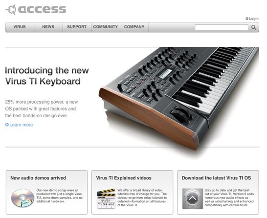
via AccessMusic:
The Access Music website has been reloaded … www.virus.info
Very Apple!
No sign of an RSS feed, though. If you find it, leave a comment!

via AccessMusic:
The Access Music website has been reloaded … www.virus.info
Very Apple!
No sign of an RSS feed, though. If you find it, leave a comment!

Looks like they were using apple.com as a design template…?
My mind thought "Apple!" immediately, too. Even the product structuring and calling out of benefits is similar.
And many Mac software sites emulate certain aspects of Apple.com — even if the pixel-constructs aren't similar, an overall aesthetic of "clean" and "space" and "subtle use of gradients" is in the air. Why, I was here today: http://www.acrylicapps.com/wallet/
I like the move in this direction more than Native Instruments' Flash-heavy, "hard to find what I'm looking for" sadness.
My mind thought "Apple!" immediately, too. Even the product structuring and calling out of benefits is similar.
And many Mac software sites emulate certain aspects of Apple.com — even if the pixel-constructs aren't similar, an overall aesthetic of "clean" and "space" and "subtle use of gradients" is in the air. Why, I was here today:
-
-
-
Torley – agreed on all points.
NI's new site is a big step backwards – they need to rethink the Flash emphasis. Access's new look is clean and very easy to use.
They need to get some new media help, though. They shouldn't be on Twitter unless they're ready to engage in a discussion, and the lack of RSS support on a new site inspires a WTF response.
I've been surfing Access' site extensively and some things I noticed:
* Their media player integration is shoddy! It distracts in a popup instead of a Flash widget on the page. (Points to NI on this, I like their actual waveform and how the samples continuously.)
* Their video tutorials UI is too simple — no volume or full-screen buttons — but it has a cool blur effect to pause it when you mouseover.
* Still some broken links, which I shall report…
So – in a Death Match between the new Native Instruments site and the new Access site, who's the winner?
They should join forces and unite against the enemies of electronic music!